 Home
Home Latest images
 Search
 Register
 Log in
Gerard Huerta
Page 1 of 1

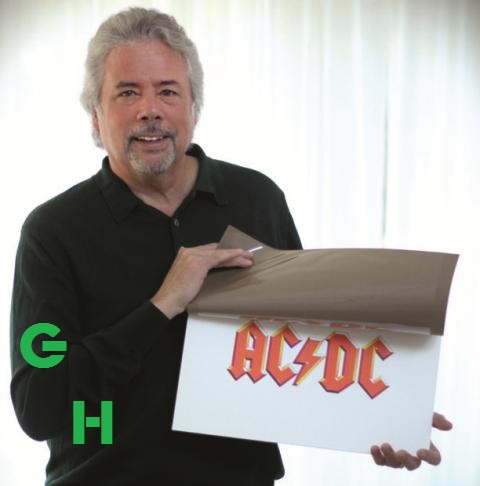
Gerard Huerta
![]() by T.N.T. Tue 26 Jan - 18:19
by T.N.T. Tue 26 Jan - 18:19
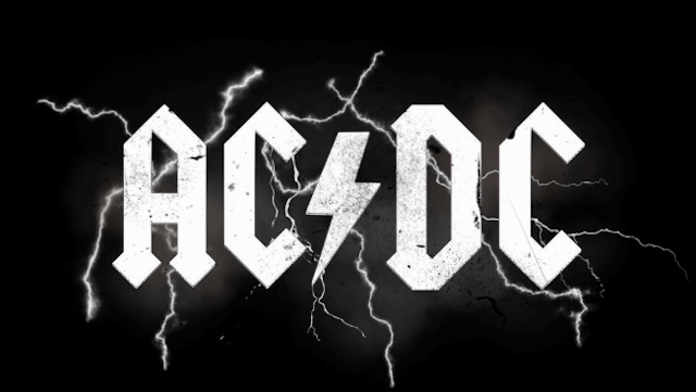
The man who designed AC/DC’s iconic logo never got a cent in royalties!
AC / DC's logo is credited to Bob Defrin, Atlantic’s creative director, but Defrin came up
with the album cover image.
The logo, one of the most recognisable in music if not design history, was the invention of Huerta,
then a 25-year-old from Los Angeles who’d also come up with the lettering on the band’s High Voltage
album’s US release in July 1976.
“Bob put together the visual of the band and sky for the cover,” Huerta says.
Huerta saw the logo on the US issue of Let There Be Rock for the first time.
It was, he claims, a one-off commission specifically for the album.
“I still have the purchase order and invoice for the job,” he says.
“I was paid what was fair for an album lettering job at the time.
It was done for a specific album.
They used something else for a follow-up album [Powerage], then came back to this.”
“Typically he would hire me, as most record art directors did, to produce multiple sketch ideas
and then one was chosen for a final.
I produced [the logo] as finished full-colour artwork, a combination of India-inked outline,
colour overlay film and airbrushed gouache.”
For a man who has contributed such an important element of AC/DC’s branding and could be seen to have
helped make the Youngs and their record companies a fortune in sales, you would think Huerta would get a royalty,
especially when the logo was designed for one album, not for AC/DC’s use in perpetuity.
Not so.
He only ever got his original commission fee and has never had any contact with the band.
Not a phone call.
Nothing.
He didn’t involve lawyers; he just let it be.
The original artwork is in a box in his archives, untouched.
“It was 25 April, 1977, when I completed that artwork,” says Huerta, who has also designed logos for Boston,
Foreigner, Time magazine and Pepsi.
“The letter forms are based on the first printed book, which was the Gutenberg Bible.
You can see many samples now on Google Images, although it took a bit of research in those days.
“The drawing of the AC/DC lettering, with its less than generous letter spacing and the lightning bolt that is drawn
as if it is a letter form, makes it read not as five individual characters but one complete symbol or mark.
Its perimeter is serrated and sharp.
A traditional A is a triangle shape, a traditional C is based on an ellipse or circle, and a D is a combination
straight and curve.
All of these letter forms have been forced into a perfect vertical and slightly adjusted 45-degree angle.
It is the only piece of lettering I have done that is made entirely of straight lines.”
And one that has gone on to be almost a cliche.
Hard rock and Gothic-style logos go hand in hand.
“I have not found anything predating this style for a band but I could be wrong,” he says.
“I did not intend that it should be the look for certain kinds of rock, as I was just designing
what I thought would work for an album cover and a band.
But when I saw the Blue Öyster Cult-influenced Spinal Tap logo in the ’80s,
it was clear this look had become the classic rock parody.”
T.N.T.- Admin
- Messages : 1467
Date d'inscription : 2015-02-28 -

Page 1 of 1
Permissions in this forum:
You cannot reply to topics in this forum|
|
|